Meet the team
Meet the Graphic Designer Behind our Rebrand
Rafael Menezes - Graphic Designer
1. What is your role within the Albex group, and how long you have worked for the group?
I'm a graphic designer at Henley Bridge, one of the Albex group of companies, and I've been here since 2021. My role involves creating a variety of design materials, including branding, packaging, product guides, presentations, marketing content, social media visuals, videos and photography. Essentially, I handle all design-related tasks to bring our brands to life.
2. How did you incorporate our brand identity into the design, and what makes this packaging stand out?
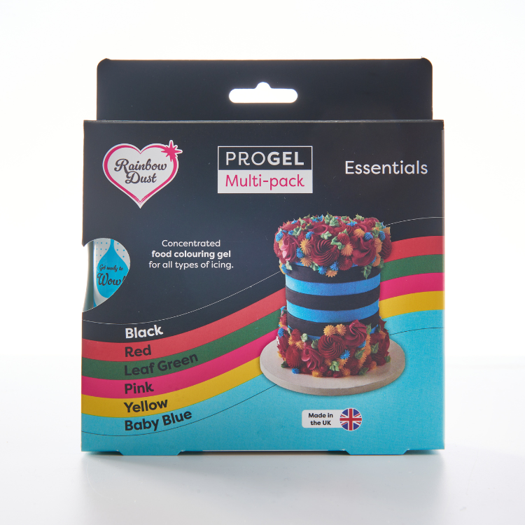
Rainbow Dust is all about creativity, fun and quality, so the new design needed to reflect that.
For the logo refresh, the key was modernising while keeping the brand recognisable. The heart shape and sparkle remained with slightly changes, as they are central to the brand, but the typography was refined for a more elegant and professional look. The softer, more balanced font gives the brand a more premium feel, aligning with the quality of the products.
For the packaging, my goal was to capture the brand's vibrant, creative spirit while introducing a fresh, premium feel, improving both practicality and visual consistency across the product range. The design also communicates the “wow!” effect that the products create, which is a huge part of Rainbow Dust’s identity.
3. What key features did you incorporate into the design?
The new design focuses on consistency, clarity and impact, with strong, recognisable branding that makes Rainbow Dust products easy to spot.
The packaging features a heart-shaped cut out, allowing customers to see the product inside. Since vibrant colours and creative effects are key to Rainbow Dust, this helps showcase exactly what they are getting. The layout is clean and highlights important details like professional quality, UK manufacturing and sustainability.
You can also find clear usage instructions, including dosage, application and storage, which make it easy for bakers to achieve the best results. The design works seamlessly for both UK and EU markets, incorporating multiple languages.
4. What were the biggest challenges you faced, and how did you overcome them?
A big challenge was making the design feel bold and fun while still looking premium. I refined the colours, typography, images and layout to keep it eye-catching but not overwhelming.
Fitting in all the legal info and translations without making the design look crowded was also tricky, so I structured everything carefully to keep it clear and readable.
I also had to test a wide range of colours to make sure they accurately represented the products. Getting them just right across different packaging formats took some fine-tuning, but it was worth it for a vibrant, true-to-life result.
To overcome some of these challenges, I had huge help from the Rainbow Dust team. Their insights and clarifications about the products and how they work were invaluable, allowing me to make informed adjustments when necessary.
5. What did you enjoy most about working on the project?
What I loved most about this project was the creative freedom and variety it offered. Exploring different ideas, refining concepts and bringing everything together in a cohesive way was incredibly exciting.
I thoroughly enjoyed the challenge of evolving a much-loved brand while staying true to its identity. Seeing the transformation from the new logo to the final packaging was hugely rewarding, especially ensuring that all elements worked seamlessly across the range. Knowing these designs will inspire bakers to create wonderful creations makes it even more rewarding.